We all know the feeling. Someone is talking about something very important in great detail, and we should be fascinated, but our mind starts to drift off and before we know it, we’re like, “Huh?”
When that happens at a doctor’s office or hospital, we might not have a second chance to hear everything, and printed handouts might be really hard to understand (they're often written at college reading levels). People have so much trouble understanding information about their health and care that we’ve decided to take a different approach at RallySM.
Any time the editorial team approaches new content — whether it’s our iconic Health Survey, a new article, or a cool visual piece — we first take a look at the material and ask ourselves, “What’s the best way to present this information?”
Often, text does the job very well, but we have some rules. Our editorial team has award-winning experience in online health journalism, which requires us to convey complex information in ways that are easy to understand. Every time we write, we’re very mindful that we have a large, diverse audience with a range of ages, education, and experiences.
In our writing, we follow the example of radio journalism — we go for a clear, conversational tone, use simple words and short sentences, introduce facts and ideas one at a time, and use other clear communication best practices. Think “Marketplace” meets health.
Sometimes when we have more complex materials it makes more sense to present the information visually, and that’s when editorial partners with Rally’s awesome experience design team drawn from the worlds of advertising, marketing, and game design. Our infographics are just one example of how our information design philosophy blends our strong editorial and visual design skills.
When designing our infographics the editorial team looks at the research and comes up with a framework for the design. Once the layout is decided, we write and edit copy with the same rigor as our other content, including medical and legal reviews.
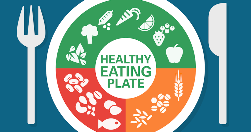
In the case of our latest infographic,”What Your Healthy Plate Should Look Like,” we wanted an at-a-glance way to convey some basics rules for good eating. We all know it’s not as simple as it sounds. The government has tried many ways to do this in the past, with differnt food pyramids reflecting the guidelines and advice of the day. The latest attempt, “MyPlate” was announced by the Food and Drug Administration in 2011.
After doing some research, we decided to use a hybrid approach. The idea behind “MyPlate” was good — show people a “healthy” plate — but given the latest nutrition research, we felt it needed an update. It also didn’t address the needs of vegetarians and vegans.
So we based our design on the Harvard School of Public Health’s “Healthy Eating Plate,” which calls out healthy oils as part of a good diet, plays up the importance of water and non-sugary drinks, and doesn’t rely on dairy. (Many adults can’t or don’t eat dairy, and there are plenty of other good sources of calcium and protein.)
Next we added examples of different foods to the plate. (By comparison, “MyPlate” just has three colored segments.) That way, a user can understand the main idea without even reading text, which makes for great visuals but also is a nod to readers with lower reading levels or health literacy. For those interested in learning more, we added bulleted text for each section of the plate with helpful tips (“Eat what’s in season, it’s usually cheaper and higher quality”) and interesting facts (“More than 90 percent of Americans don’t eat enough whole grains”).
The result: a beautiful bold graphic with content by editor-in-chief Deepi Brar and design by senior designer Raleigh Swick that packs a lot of great information into an easy-to-digest form. It’s another example of the thoughtful information design that drives all our work.
DEEPI BRAR
Rally Health


